
Crest and Logo


- Details
- Hits: 49422
Before 1910 the crest of the De La Salle Brothers with the phrase “Signum Fidei” had been used as the official crest of our Congregation. The General Chapter of 1910 decided that a distinctive crest should be adopted for the Christian Brothers “Fratres Christiani de Hibernia”. As a result, various designs were developed and presented to the Chapter of 1920 which chose the design of Br. Angelus Hoban.
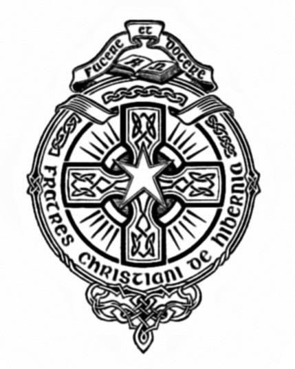 The principal features of the crest were:
- The star at the centre evoking Dan. 12:3, “those who are wise shall shine like the brightness of the heavens; and those who turn many to righteousness, like the stars for ever and ever.”
- It is set upon a Celtic cross, supreme Christian symbol of redemption.
- The cross sits on a circle, symbol of eternity.
- The outer circle has Celtic tracery, denoting the birthplace of the Congregation.
- The open book at the top signifies our educational aims as a Congregation.
- The letters Α and Ω, Alpha and Omega, reflect Rev. 21:6 “I am the Alpha and the Omega, the beginning and the end.”
- The ribbon above bears the motto “Facere et docere”, evoking Mat. 5:19 “he who does them and teaches them shall be called great in the kingdom of heaven”.
A variation incorporating the name “Fratres Scholarum Christiani de Hibernia” appeared in 1923 as the new title of the Congregation was to be incorporated in the new Constitutions of that year. This was to remain the official crest until the General Chapter of 1966.
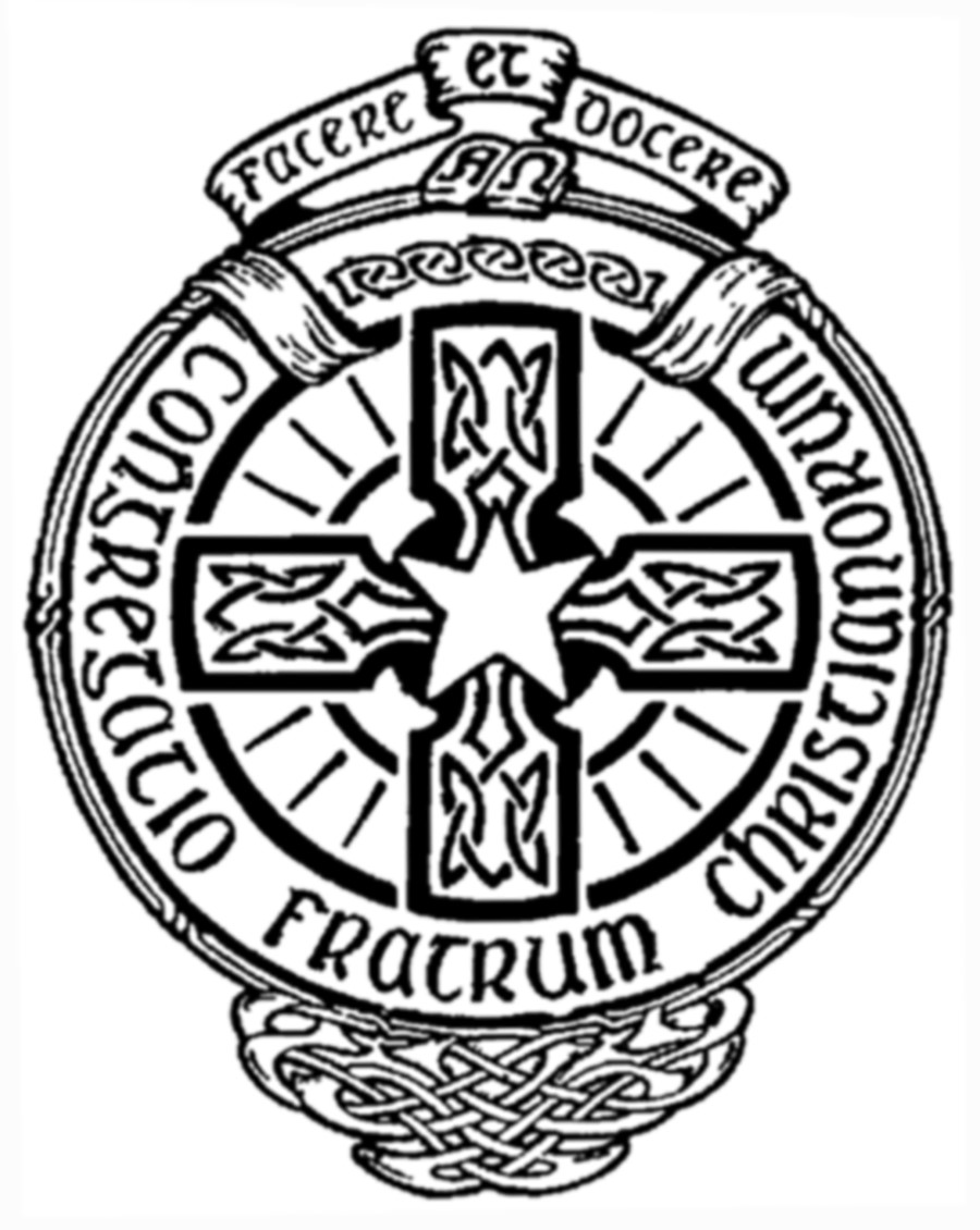
The change in title of the Congregation to “Congregatio Fratrum Christianorum” necessitated a change in the crest. The original Celtic script was changed in favour of more modern lettering. After 1972 a design by Br. Richard Kiely was accepted to coincide with the publication of the Constitutions that year. It returned to the original circular form, reintroduced Celtic lettering, and simplified some of the design of the Celtic interlacing for greater definition.
![]()
The central symbol of Christianity, i.e. the cross, is also the central to our expression of our identity as Christian Brothers. The shape of the cross takes its origin from Celtic spirituality as does our Congregation. The significance and the insights of Edmund Rice are highlighted in the stylised E which is incorporated in the logo.
As disciples of Christ, Christian Brothers are continually called to let go and leave behind all that prevents us from living faithfully the values of the Gospel and from promoting the Kingdom of God. This call and response is shown symbolically by the movement of the circle away from its regular pattern. Our call to internationally, which flows from the time of our founder and continues on to this day, is not just in geography but also in moving, as flexible and mobile followers, to meet the needs of the times. The new leaves and shoots express new life in the Congregation and signs of hope for our Brothers and for our world. Yet even the new leaves continue to express our growth through fragility, by their links to the cross and in the risks of branching out.


